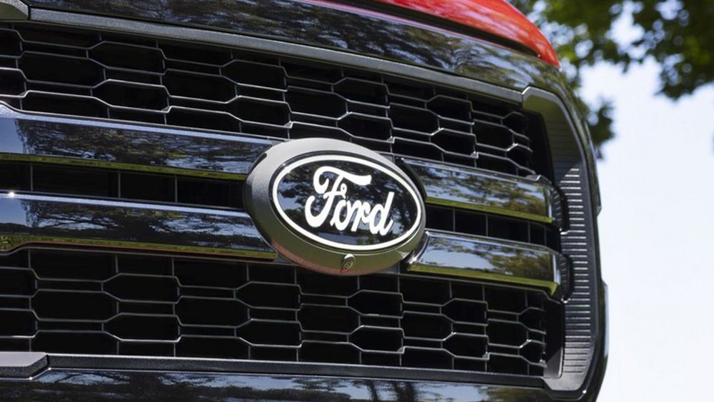
Ford Unveils Simplified, Flatter Logo for F-150 Returning to Classic 1960s Look
-
Ford has unveiled a new, flatter logo for the F-150 pickup truck that drops the 3D effects and chrome of the previous design.
-
The new logo returns to a simplified script and oval shape similar to Ford's iconic 1960s logo.
-
The move aligns Ford with the trend toward flat, minimalist branding among major automakers in recent years.
-
While not a major change, the refreshed logo enlarges the script lettering slightly to fill the space once occupied by chrome edges.
-
The logo retains familiar elements like the script lettering and oval shape used by Ford for over 100 years, avoiding a more radical rebranding.