Google Redesigns Fitbit App with Softer Look and Feel to Align with Health Insights Mission
• Google has redesigned the Fitbit app over the past 2 years to align with Material You design language after acquiring the company
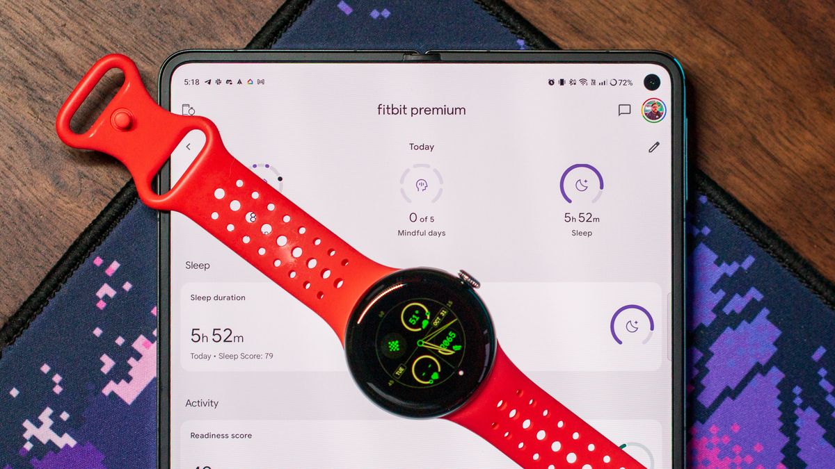
• Fitbit UX designers drew inspiration from the Light and Space art movement in California to make the app feel personalized
• The app uses rounded shapes, soft colors, and circular UI elements to create an "uplifting and compassionate feeling"
• Fitbit aims to provide digestible health insights rather than just data collection to help users improve their health
• The Pixel Watch's rounded form embodies Fitbit's design approach and sensors provide the health data needed for Google's health strategy